Five Stories Told Through Data Visualization
While data has taken the guesswork out of marketing, telling visually compelling stories is still an art. The rise of artificial intelligence in organizing data quickly will continue as more devices join the Internet of Things. As a result, data scientists will sit alongside creatives in future marketing campaigns. Rather than fear data and automation, marketers should see the innumerable opportunities to connect with their audiences. The bringing together of science and creativity is demonstrated brilliantly in stories told through data visualization.
Due to the demand from organizations in every industry, many software companies have developed tools to assist marketers in data visualization. Here are seven of the best providers in that space ranked by Forbes. While these tools vie for shelf space in each marketing stack, the storytelling will still fall to creatives to accomplish measurable, branded moments.
Five Examples of How Marketing Can Melt the Heart Through Data Visualization
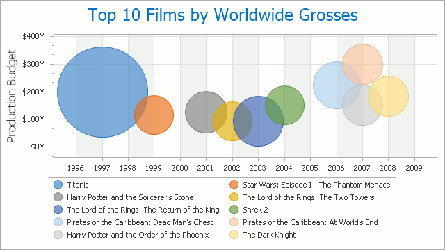
1 – What are the top grossing films worldwide, you ask?
This bubble chart adds dimensions to the answer that a regular list might not.
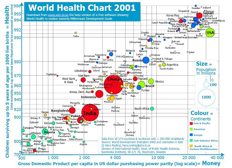
2 – How does where children are born impact their survival rate?
This compelling chart shows the correlation of Gross Domestic Product and children surviving up to 5 years at the turn of the century.
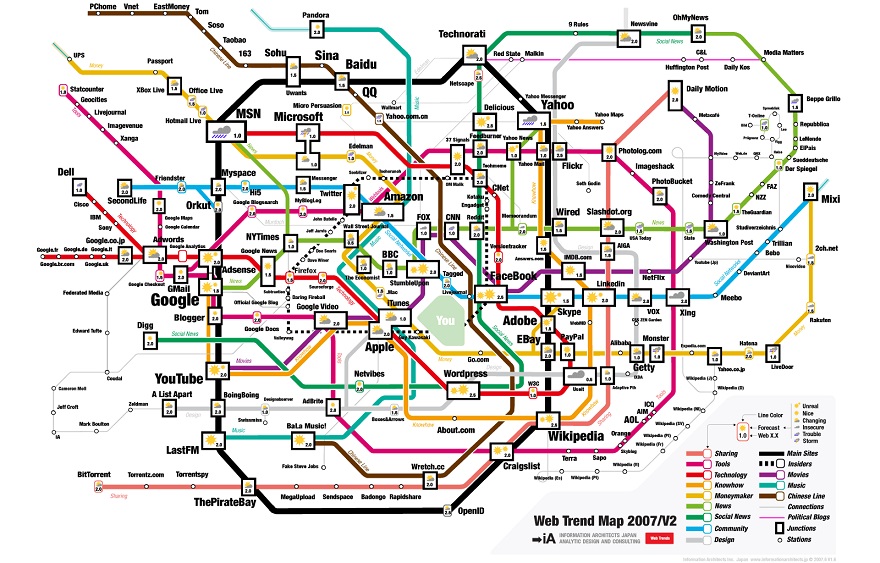
3 – What are the most successful websites?
Here’s a map that shows the top 200 websites in 2007.
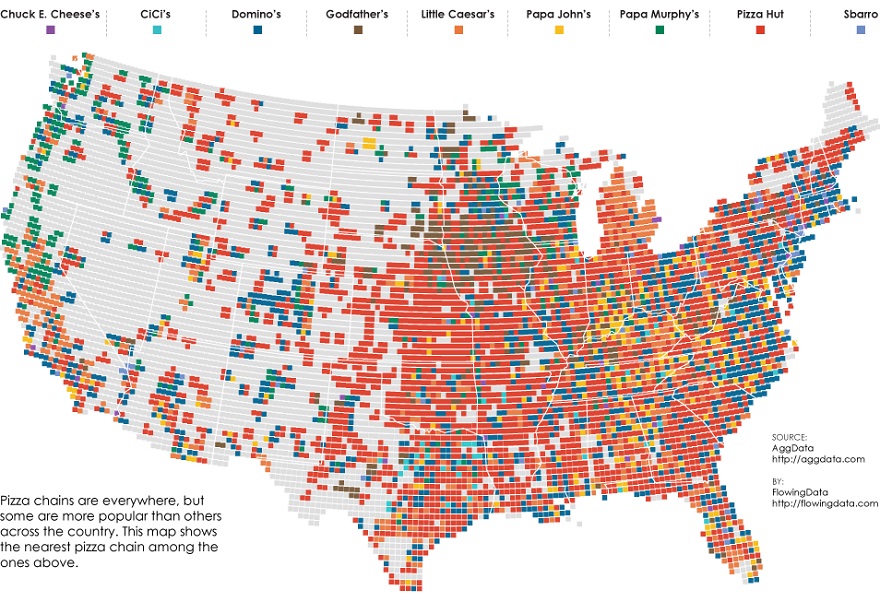
4 – Who wants to get a slice of pizza?
Here are the most common pizza chains by state.
5 – Why did Napoleon’s invasion of Russia fail?
This famous visualization shows the impact of freezing temperatures on his troops as they marched toward Moscow.
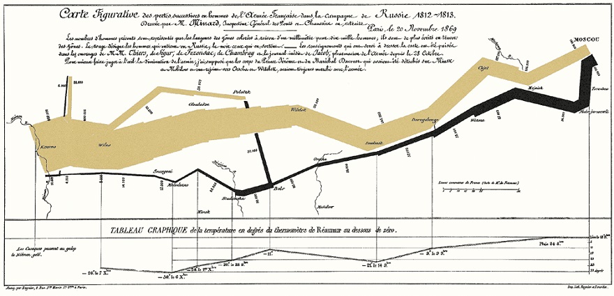
The context of any story is critical to its success. The examples above were chosen from Google Images because of there visual appeal with the exception of the recognizable Charles Minard chart. These are representations of the influence data has on marketing and the opportunities it creates to tell compelling visual stories. While marketers can zero in on the relevant subject matter, telling meaningful stories will still require the human touch in order to melt the heart. In the end, the data will show whether it worked or not.